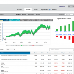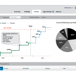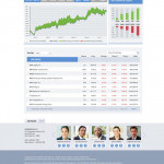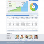
As Principal Designer at Siteworx, I had unique opportunities to work on some very cool concepts for clients as part of the sales process. One of these was a redesign of the private wealth management platform for Goldman Sachs. I worked with the CEO/President of my company on this effort since he had identified that his broker had a very poor user experience. The user type for this was someone who had a really large net worth and did not want to actively manage their wealth themselves, but would like to check on the progress and review status with their advisor on a monthly or quarterly basis.
I had access to the tool and did a basic heuristic analysis and quantified the basic user goals as follows:
- To review the portfolio quickly to measure performance
- To understand what they are invested in
- To collaborate with their advisor
We came up with some really cool charts to measure performance at a glance, and proposed some live video and annotation features to aid collaboration. I worked with one of our very talented visual designer to bring my wireframes to life and turn these around in just a few short days.
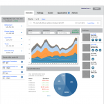
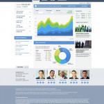
Then we had to pitch the client on these ideas. I went to the meeting with the President along with another Project Manager. We essentially convinced them to take on this effort, even though they were not thinking previously that they needed to do this redesign. By showing them the potential of our design, the client was able to see the value it would add, not only to their customers, but in efficiencies with their wealth managers. This ended up being a multi-million dollar deal for the company and I felt really proud to be a part of coming up with those concepts and helping get the deal sold.

