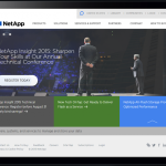
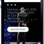
I still remember the company Christmas party in 2011 when a colleague walked up to me in front of my bosses and asked if I knew anything about responsive design. As it happened, I had just come back from a conference a few weeks earlier where Ethan Marcotte, the designer who coined the term, had presented this soon-to-be revolutionary methodology of implementing websites that would conform to the devices they were viewed on. Having been the only person in the organization to have even heard about it, I pulled out the stops to become an expert in it in a short period of time. Soon I was training designers, developers, project managers, and salespeople across Siteworx on what it was, how to do it, and what it meant for us and our clients. NetApp was the first project we started with this responsive journey. Afterwards I worked/assisted on four additional responsive design projects (Time Warner Cable, Grant Thornton, AAAS, and McGladrey) and the company sold countless others.
Alignment
For this particular project, we were assisting NetApp with the strategy and design, as well as training their development team on the methodology of responsive design. Their team had already done a lot of marketing and user research, persona building, and journey mapping. I used all those as input (though I always prefer doing the research ourselves) into our responsive alignment session. After identifying the goals of the project, the website itself, and laying out user goals, we took a mobile first approach to prioritizing content. This was a new approach at the time as we had always prioritized content the same throughout a website experience. Since we were completing multiple experiences at once, we had to be cognizant of the experience with the most constraints first: mobile.
User Testing
In this particular engagement, the client already had some ideas about design. We did not feel the client’s design was a good one and the grid and structure had no shot of working well on mobile or tablet touch devices. We set out to prove through user testing that our assumptions were correct.
We built their design into a prototype and tested it with many users. I guided one of our junior UX team members in building the prototype, as well as creating the questions for the user test. In the end, it didn’t test well, which gave us the opportunity to redo the design while still keeping some core elements of the client’s design.
Design
I assisted our design team in thinking responsively about their design and introducing the mobile first concept as well. We made sure to design the entire mobile experience first, building a prototype that users could click through and then ratcheting it up for the desktop experience. Their visual design and colors were fairly set, so there was not a lot of art direction to this one. I was happy to see their development team complete the project and continue to tweak it over the years.


